Why beige is making way for bold: it’s all about Instagrammable interiors for Gen Z, as the neutral tones preferred by Kim Kardashian and Kanye West are being phased out for more vibrant decor themes
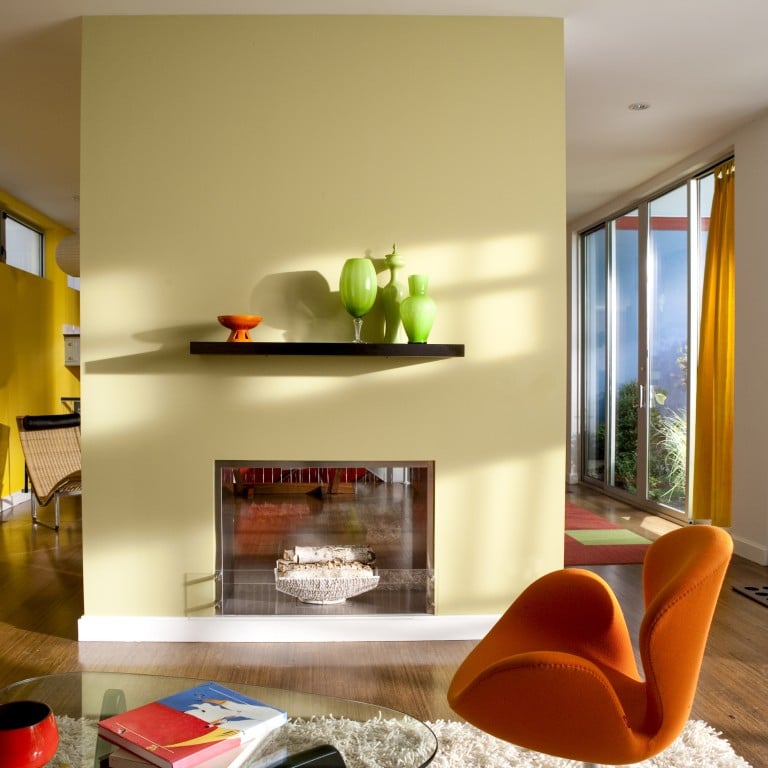
“The narrative for 2024 is all about energy, vibrancy and life. Neutral tones were all about calm and simplicity, then we moved into earthy tones to connect to the natural environment after the intensity of the Covid years,” explains Emma Maclean, founder of Hong Kong-based interior design studio EM Bespoke.
“Now life is being injected into these earth tones and these colours are evolving into dramatic yet warm, vibrant shades we can easily embrace into our spaces,” she says.
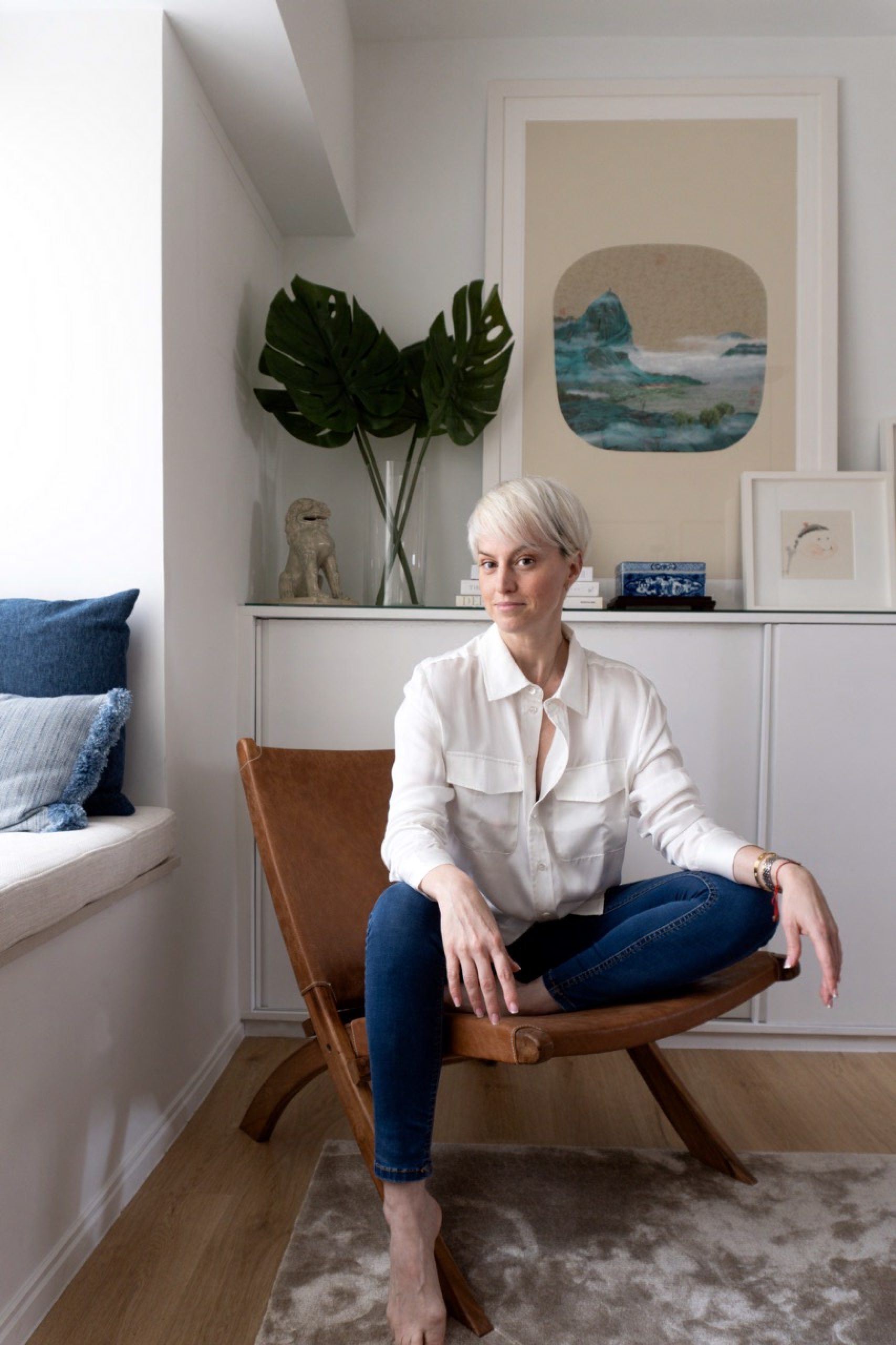
This move into colour is a natural evolution, especially for the younger generation who are spending more time in their homes and looking for more photogenic spaces to post on Instagram. While neutral colours are still viewed as safe, if formulaic, bolder hues are being embraced as a fun and easy way to express one’s personality and style, especially in private living spaces.
“Having a colourful interior plays an important role in awakening our senses – surrounding yourself with colours, light and textures is a way of keeping them alive,” says “queen of colour” India Mahdavi, the interior designer behind hip restaurants like Sketch London, among many others.
5 lifestyle habits for healthier skin, from diet and exercise to sleep
As with the fashion industry, there are certain colours that trend each year. Mahdavi singles out pink, which she describes as soothing and comfortable, and yellow, which attracts light. Maclean highlights cheerful, vitamin-inspired hues like orange, yellow and apricot, or energising tones such as red and blue.
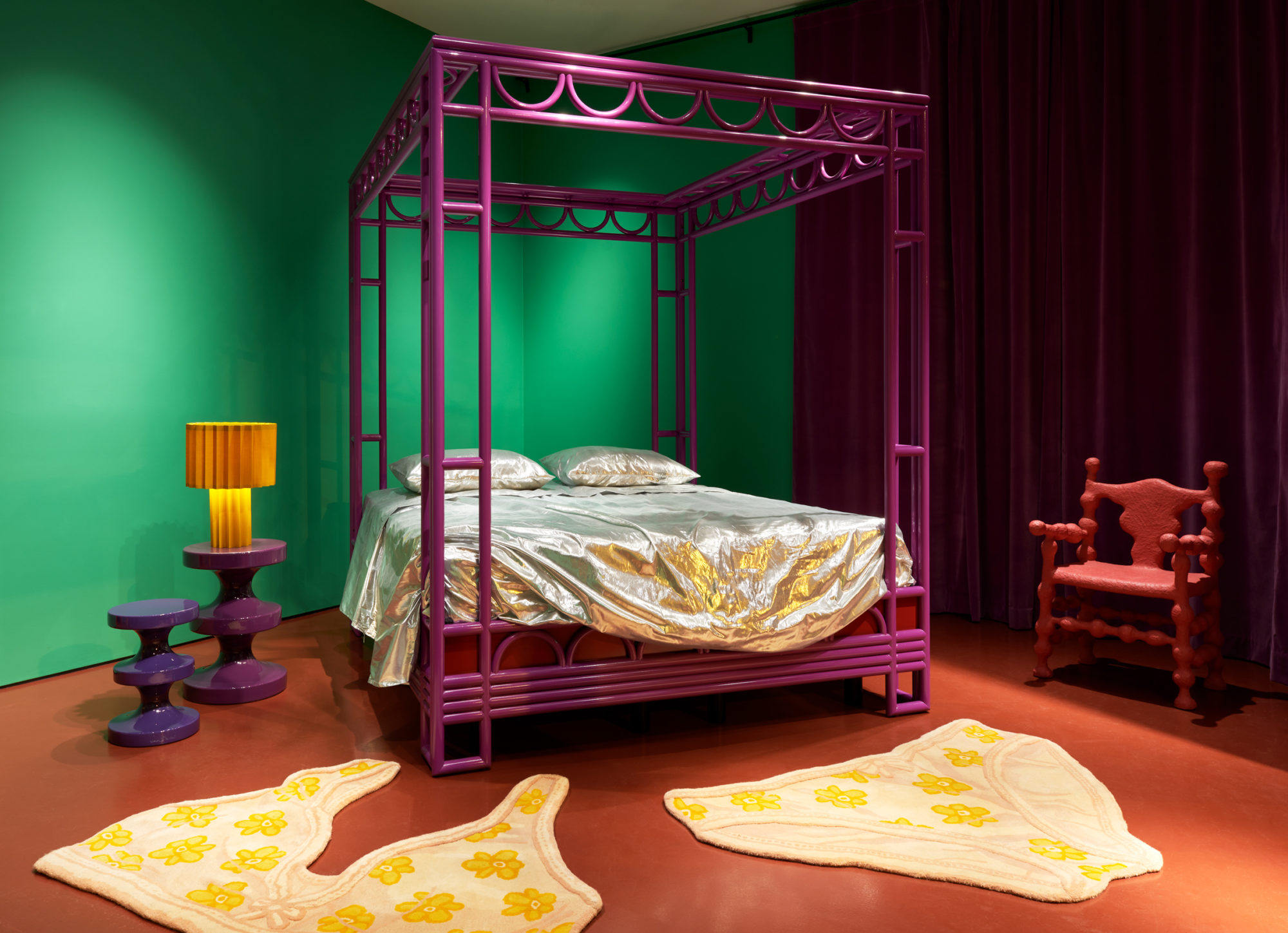
“Green is also having a moment. All around the globe, people are becoming more mindful of the natural world and we associate green with nature,” adds Bryony Sheridan, buying director at Abask, an online shopping destination for home interiors and collectible design.
“As a continuation of that, it’s a colour that evokes feelings of wellness, health and vitality, which are wholesome sentiments to surround oneself with through colour,” she says.
Bespoke wallpaper: hand-painted home decor is the latest thing in luxury interiors
One of the biggest benefits of working with colour is that the options are endless – currently Pantone offers over 2,000 different shades to choose from, and certain suppliers and brands such as paint specialists Farrow & Ball offer customised shades. Personal preference and style are a major deciding factor when it comes to choosing the right palette for your home, but there are some other easy guidelines to follow for the uninitiated.
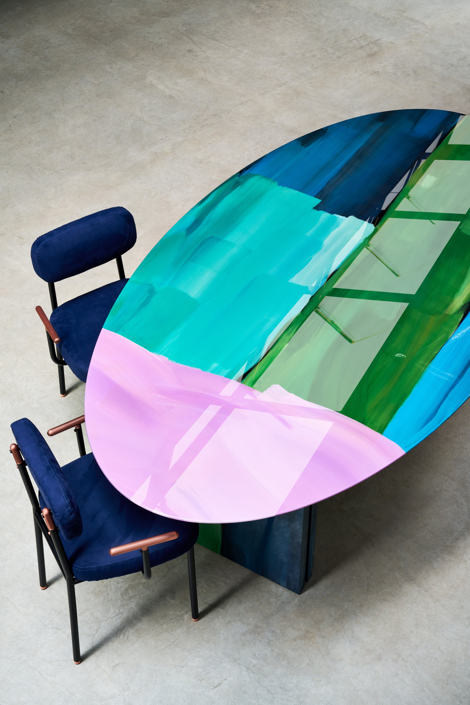
“The best way to start is to identify your interior type and remember that colour comes in many mediums and materials. For the modernist, it works well to focus on a strong colour like mustard, then complement it with warm tones of brass, wood and leather,” says Sheridan.
“If you’re a minimalist, go for one colour and make it pop across multiple items, then keep everything else white. If you’re into classic interiors, then it’s effective to create a layered look where the underlying colour is the same throughout. And if you’re a bohemian, then indulge the full rainbow spectrum,” she says.
Maclean also advises clients to keep context in mind and be aware of where the colour is going to be applied. It’s good to think out of the box. Painting your kitchen or bathroom cabinetry in a bold colour such as blue or green is both unexpected and makes a statement.
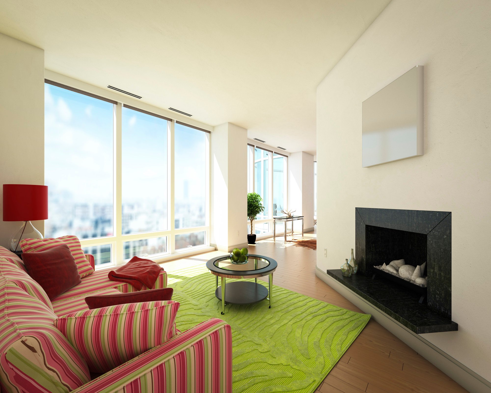
The size and location of the space will also influence your colour choice. For example, larger spaces with high ceilings can carry off bolder colours, while smaller spaces benefit from lighter tones like blush or turmeric to give the illusion of a larger space. Spaces with plenty of natural light are best complemented by lighter hues.
“These examples illustrate that it is more about intensity and tone rather than the actual colour itself. If you have a colour and you are in love with it, explore the different variations and see which is best for your favourite room,” says Maclean.
Inside The Fabrick Lab: meet ‘material innovator’ Elaine Ng Yan Ling
While it’s tempting (and easy) to just choose one accent colour for your home, Madhavi advises clients go with a minimum of three colours to create more of an impact. Maclean suggests her clients reference colour wheels – colours that sit opposite each other are usually considered complementary, and will add depth, dimension and contrast to an interior.
Mahdavi’s approach is a little less conventional. “I see colours like friends, I like them to speak to each other. And it’s even better when they argue,” she says.
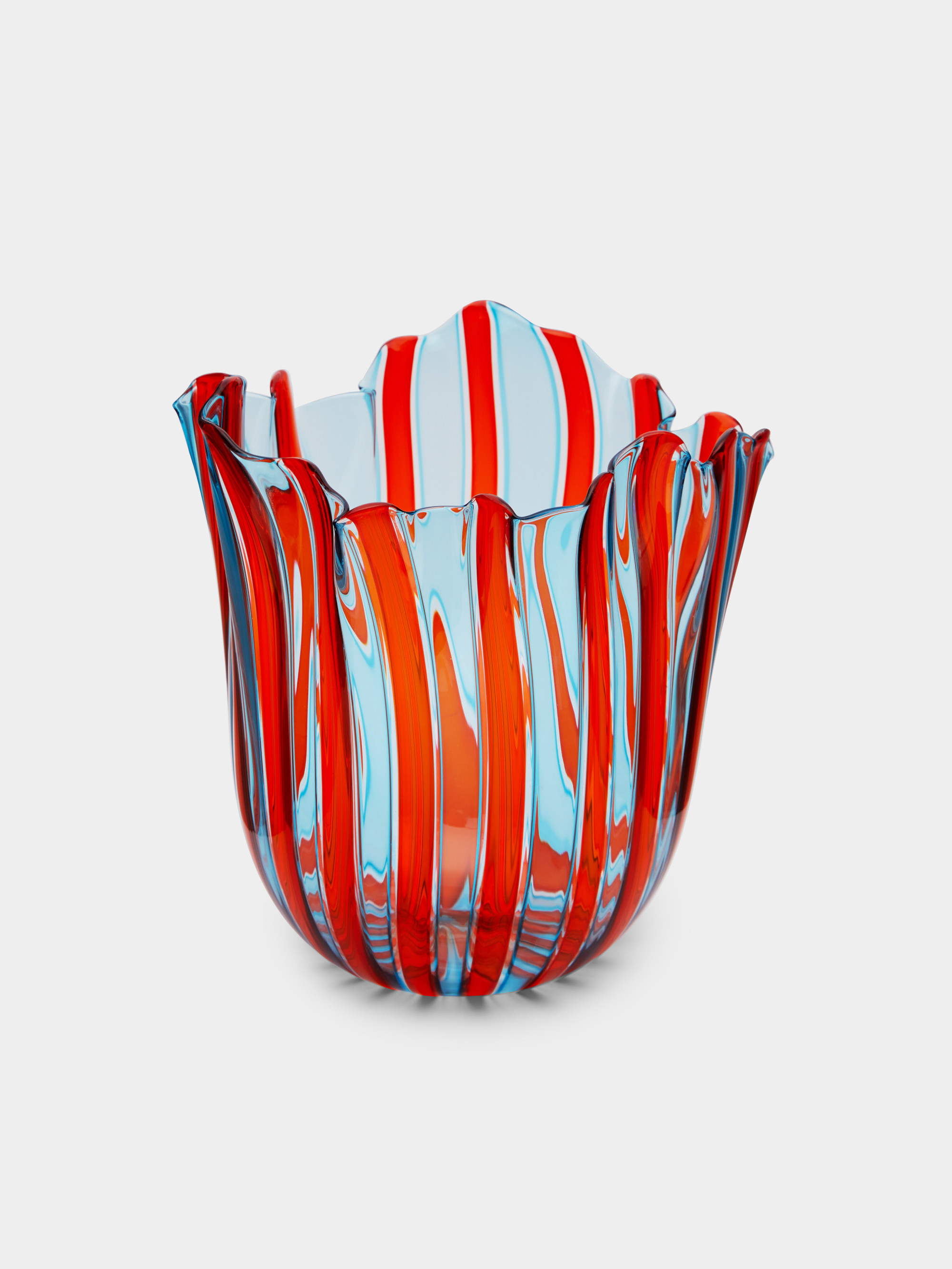
Of course, the biggest challenge when it comes to importing colour into your home is that you may run the risk of it looking dated in a few years. For that reason, experts suggest incorporating pops of colour through soft furnishings, furniture and other accessories. Easy additions include rugs and throws (which are great for colour blocking), drinking glasses or vases, cushions and leather trays. Even tablecloths, such as Gregory Parkinson’s block-printed cotton designs, can transform the mood of a room indoors and out, all year round.
“Home-design accessories – or ‘the smalls’ as we call them – are one of the most effective ways to incorporate colour because, like our wardrobes, we can swap things in and out, style them in different ways, and bring a new character every day,” says Sheridan.

- Minimalist tones are so yesterday – 2024’s interior design vibe is all about energy, as we ditch the earthy tones of the post-pandemic era for more dramatic hues
- India Mahdavi, interior designer for hip restaurant Sketch London, singles out pink and yellow as colours to watch, which she describes as soothing and comfortable