
How a Chinese researcher devised the world’s most cited Covid dashboard
- Dong Ensheng was the force behind the Johns Hopkins Covid map, which will end updates soon
- The dashboard became a key tool for governments to understand the virus and find ways to fight back

Dong’s scientific mind began thinking about the situation. Then one day, after discussing the situation over a coffee with his professor, Lauren Gardner, Dong began to devise a system to track coronavirus cases.
China’s Covid stimulus misses the mark as local finance woes grow: report
At the time, Dong had no idea that a project he had begun working on for his doctorate thesis would evolve into such a comprehensive and powerful public health resource over the course of the pandemic.
The tracking map Dong developed has since become known as the Johns Hopkins University Coronavirus Resource Centre – the JHU Covid-19 map. It has been a valuable tool used by governments to understand the development of the pandemic and how to tailor policies based on the data. The map had also helped the public understand the scale of the outbreaks, Dong said.
The Coronavirus Resource Centre has also been a source of information about other key trends, such as disparities in the rates of disease spread and health outcomes related to factors such as race, income and access to private health insurance.
03:12
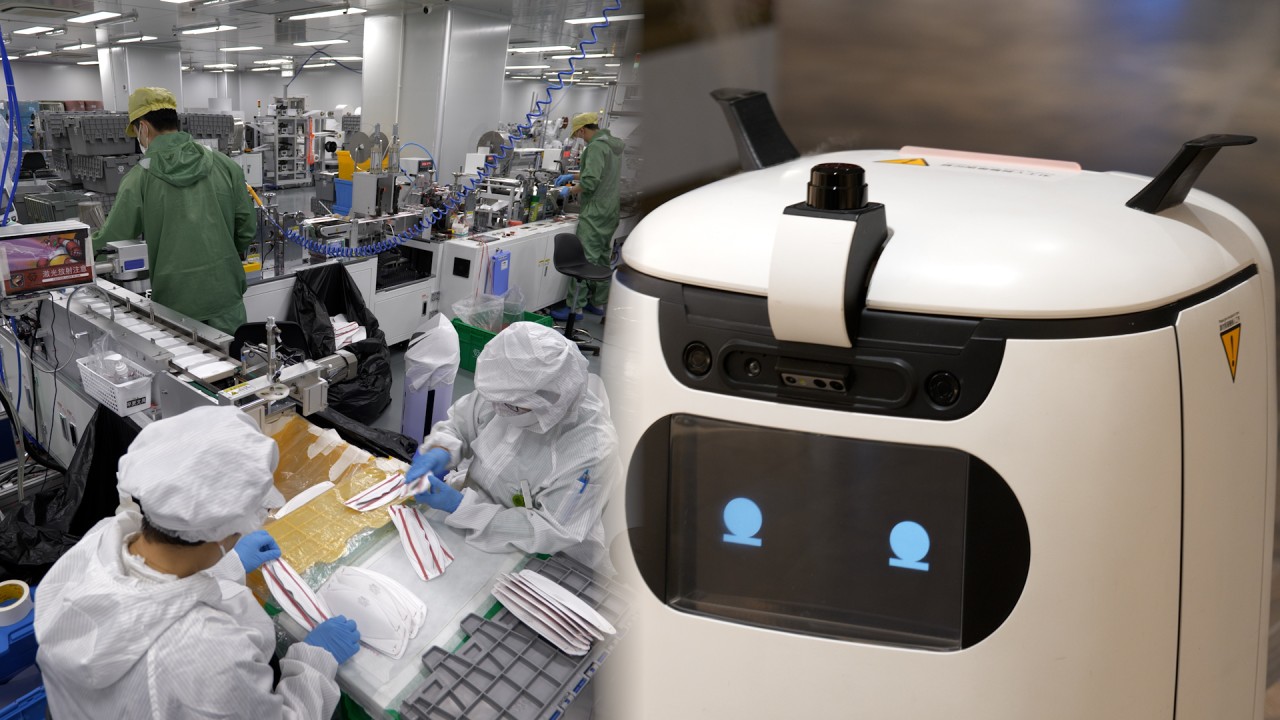
Hong Kong mask manufacturer diversifies business as city lifts face-covering rule
Since the website’s launch, the dashboard has been viewed more than 3.6 billion times globally, according to the university.
The dashboard will stop updating on March 10.
Other online dashboards were devised over the course of the pandemic, but the JHU’s – which featured visualised data on the numbers of infections, deaths, testing, contact tracing and vaccinations – stood out partly because of how quickly it updated.
“For about two years that ended in the middle of last year, our dashboard updated once every half an hour internally and the visualisation once every hour. The data is completely open on GitHub,” Dong said.
03:18
Beijing rejects US agency report saying Covid-19 likely emerged from Chinese lab leak
The first version, on January 22, 2020, took Dong just nine hours to launch. At the time, Dong was the only person collecting and inputting data. Fellow doctoral student Du Hongru would verify the data to ensure accuracy. Dong said he aimed to update the site three to four times a day, but he often provided up to six updates, working well after midnight.
Other people began to volunteer and soon the team had grown to more than 40 people. Eventually, the data collection became automated, allowing for more frequent updates with humans still overseeing the system in case there were errors.

Dong, who studied geographic science at Southwest University in Chongqing, China, and then geography and statistics for his master’s degrees at the University of Idaho, said his interest went beyond data, as he was in plotting it.
“If there are 100 cases in Beijing, I am more interested in representing them as dots in the map to visualise its distribution,” he said.
Dong and his team faced several challenges in constructing their map – they had to make it accessible for colour blind people, and they had to tackle the issue of inconsistency over different case definitions across many countries.
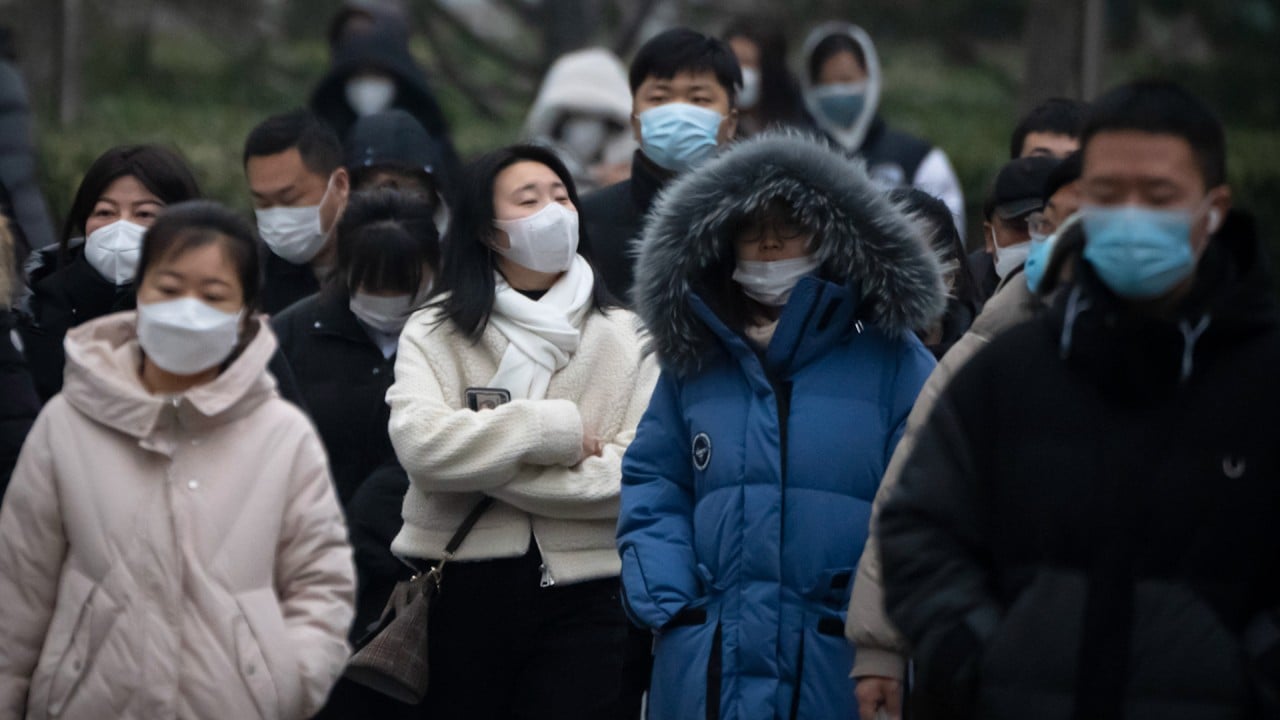
As Covid-19 wanes, seasonal influenza cases are surging in China
While the resource centre announced last month that it would stop updating on March 10, the raw data will remain publicly accessible.
Many people had also felt the pandemic was already behind it, Dong said.
“It is good timing to put a stop to this.”
